
The on-boarding and training process can be dull and grueling for new employees. What happens when we give employees control over when and how they want to learn?
In 36 hours, my team was able to create an engaging product that would self-motivate Home Depot employees to increase their product knowledge while on the job, whilst implementing gamification into the user experience.
Presented with this challenge at ElleHack 2018 by Home Depot, I participated in the UX research and design for this project, conducting user interviews, analyzing pain points, drafting user journeys and prototyping the final product, ensuring that the UI design aligned with Home Depot's brand guidelines.
Before diving into conducting user research and coming up with solutions, my team focussed on defining the problem and setting guidelines for ourselves. We framed our problem statement by listing the 5 Ws:
What is the product?: A mobile application.
Who is it for?: Home Depot's in-store associates.
Why does it need to be created?: To house product knowledge content.
What does it need to do?: Be interactive and engaging through gamification.
Where/When will it be used?: On the floor, during training.
We reached out to multiple Home Depot employees, as well as employees from other big box stores, such as Ikea, and conducted phone interviews to get a feel for their work flow, the training process and some of the challenges they face while at work.
Our ability to conduct user research and gather insights in a short amount of time set us apart from other competitors. Here are some questions we asked them during the interview process:
1. What was the training process like at your workplace?
2. How does your workplace reward stellar employees?
3. What are your motivations to become a better employee?
4. What are some pain points you experience in your day-to-day, especially as new hires?


When we were presented with the challenge, the sponsor team wanted to incorporate gamification into the product. My team dove in further to see how gamification could be beneficial to the solution.
This article highlights the benefits of gamification in corporate training. On top of making training and learning more fun and interactive, gamification allows employees to change and adopt new habits. Gamification also gives employees quick feedback, through points or rewards, so they can see their performance level at a glance.

People like to be acknowledged and appreciated for their hard work. Our research showed that Home Depot employees want to be good at their job and want their colleagues to know that they're good at their job. Implementing a rewards and recognition system into our product allowed us to tap into their intrinsic motivations and encourage them to complete their training modules.
Employees earn points by completing training modules, quizzes and giving their co-workers shoutouts. Their accumulative points lets them enter in a monthly draw. Home Depot branches hold these draws/raffles to reward their employees.

Our main goal was to increase employee's product knowledge. Current training modules throw a lot of information at people in a short amount of time. Many employees actually skim through their training, rather than actually taking in all the information.
Short quizzes and training videos allow employees to test their knowledge and learn at their own pace, anywhere and anytime.

Homebot is a chatbot that is designed to aid Home Depot employees and answer any product related questions they might have on the job. Homebot would house all of Home Depot's product knowledge content and would inform employees of the location, quantity and availability of the items in store.
In the future, I'd like to implement AR into Homebot so that employees can navigate the huge stores easily and efficiently.

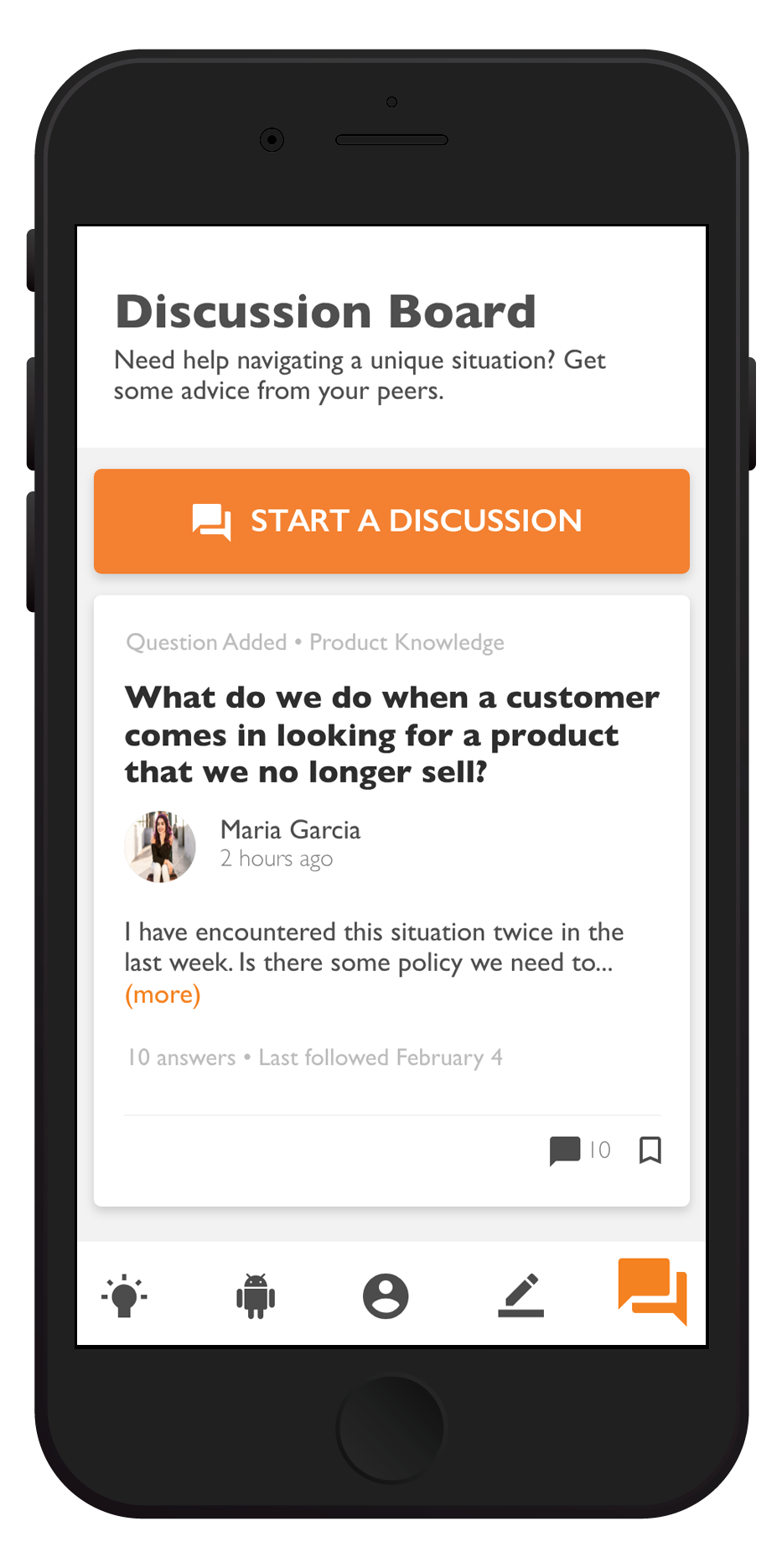
Newer employees feel comfortable reaching out to their colleagues for help, especially when dealing with unique cases on the job. I implemented a leaderboard that showcased the top performers at the branch as well as a discussion board so that employees can reach out to each other for help.
They're also encouraged to give fellow employees shout-outs. This helps boost morale and is another way for both parties to earn points.


It was important to us to be true to Home Depot's brand voice. One core aspect of their mission statement is "taking care of our people". We built an experience that puts Home Depot's employees' success first.
We also worked with the sponsoring team to ensure that our style guide matched theirs so that the app looked and felt liked a Home Depot product.


This experience was definitely a game changer in my design journey. My team placed first in this category. It was my very first hackathon and the first time I really dove into doing UX and UI outside of the classroom. I want to thank my team members for being kickass women and for teaching me so much in just 36 hours. I also want to thank the Home Depot sponsors for believing in us and for being so enthusiastic about our project. Lastly, thank to ElleHacks for providing women with a safe space to hack and create. It is so important to increase visibility of amazing, hard-working and talented women in tech.
Looking forward, I'd like to refine the visual design of the project. We stuck to Home Depot's brand guidelines, but I'd like to explore different typography, colours, micro-interactions and UI design to give it a more modern, fresh look.