headspace brand analysis + motion design —

using micro-interactions to craft a delightful experience

My Visual Narrative class was tasked to analyze an existing app and see how micro-interactions could be applied to further their brand narrative and enhance the user experience. My mind immediately went to Headspace.

I started using Headspace a little over a year ago. I saw an ad on Facebook and the designer in me was attracted to their playful brand. I remember that the ad had cute motion graphics and illustrations.

However, when I started analyzing the app - it felt static. There were little to no micro-animations, even though in my mind, I had pictured the app being filled with them. I decided to tackle Headspace's app for this project and explored how micro-interactions could bring their brand story to life.

my role

Brand Analysis
Storyboarding
Motion Design

team

Rollin' solo

tools used

Adobe After Effects
Adobe Illustrator

timeline

3 weeks

the project brief

How might we implement micro-interactions into Headspace's app to enhance their user experience while remaining faithful to their brand story and vision?

headspace's brand story

Headspace is a meditation app and their main mission is to make mindfulness and meditation easily accessible so that people may incorporate these practices into their daily lives. Their motto is “Meditation made simple”.

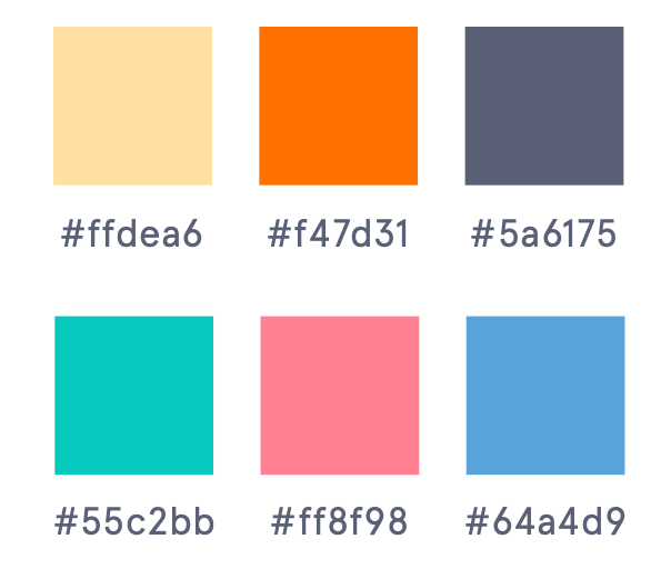
In short, Headspace is all about mindfulness and being aware of yourself, your mind and your body. They’re welcoming, friendly and calm. They convey these traits through their visual design. It’s colourful but it isn’t jarring. Everything from their typography to their illustrations has a soft roundness to them.

why headspace?

Headspace has done a great job with their branding, tone and voice. When I chose Headspace for this project, I expected there to be more motion graphics but I was disappointed at how still the app felt, contrary to their ads, which contain delightful and cute animations. I wanted to take that same energy their marketing displayed and bring it to the app, while staying faithful to their brand voice.

Headspace’s logo is a slightly imperfect circle. It’s meant to represent the “imperfect nature of the mind”.

analyzing the app

stiff and still

I began with a thorough analysis of the app and explored what interactions existed and where there was room for further exploration.

The first thing I noticed was that loading screen animation is quite anti-climatic. When you open the app, the Headspace logo appears on a white screen, followed by the home page once the app has fully loaded. There’s no indication whether or not the app is loading.

user research

breathe with me

However, once you start using the app and decide to participate in a session, the app becomes alive. The play button breathes in and out, expanding and contracting like lungs during the session. This is one of the few motion graphic elements I discovered in the app. It has a purpose: it acts as a visual cue to guide users through the meditation session.

key insights & features

did I win something?

Headspace rewards its users with badges and tracks their goals and progress. However, there’s little to no motion involved. This leaves you feeling a bit disappointed and makes you feel like you haven’t progressed as much as you thought you did.

Storyboarding the micro-animations

creating micro-animations

the loading screen

I decided to tackle the loading screen with a novel approach. When users open the app, they’ll be greeted by the Headspace circle, slowly morphing into different forms and growing larger and smaller in size. This is meant to mimic a breathing cycle. Since Headspace’s main brand trait is meditation, users will immediately realize the purpose of the app as soon as they open it.

user research

meditation sessions

One of Headspace’s main motion graphic starts when users begin a meditation sessions. As users click the play button, the button becomes alive. It shifts and moves as the session progresses, filling up the loading bar along the way.

This is a very important interaction in the Headspace app. It ties back to their brand trait. Object continuity is present here as well, since this animation inspired the loading screen.

I decided to embellish this interaction a little and tackled it a slightly different way. There isn’t a path for the progress bar to follow; it is fluid, shifting and morphing freely until it is whole again.

analyzing the app

profile stats

Headspace wants their users to reach mindfulness after using their app. They want them to be self-aware, as well as aware of their mind and body.

When a user finishes a session, they can view their progress, achievements and statistics within the app. However, there is little to no motion involved in displaying these statistics. They feel no agency over their data, it doesn’t feel like they’ve accomplished anything.

I wanted to offer a novel approach through a value change motion graphic so that whenever a user finishes a session, they feel accomplished and proud.

reflections and learnings

storytelling is key

I really enjoyed working on this project. It showed me how storytelling is an essential tool when crafting experiences. It allows you to connect with your audience and, in turn, it allows them to connect with your brand story.

However, it is important to make sure that these interactions further your narrative and aren't just there for the sake of decor. I started applying these concepts to my work, even outside of design (such as this documentary I filmed for the same class).

I look for micro-animations in every app now. From Facebook's bell icon to Uber's little cars, micro-interactions allow you to connect with your user, create delightful experiences and sell your brand story.